PROBLEM WITH THIS WEBPAGE?
Report an accessibility problem
To report another problem, please contact brandon.richardson@marquette.edu.
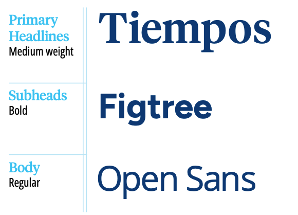
Just as we choose different words to convey different messages and different verbal constructions to address different audiences, the typeface we use can have a profound effect on our messaging. Typography helps determines how our brand’s voice comes across to readers. Our three typefaces have been strategically chosen to ensure an appropriate tone for our messages.

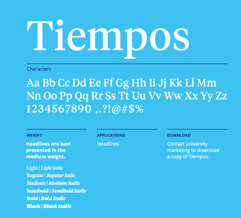
Tiempos is a modern serif typeface that’s contemporary and legible. This typeface is reserved for headlines and subheads.

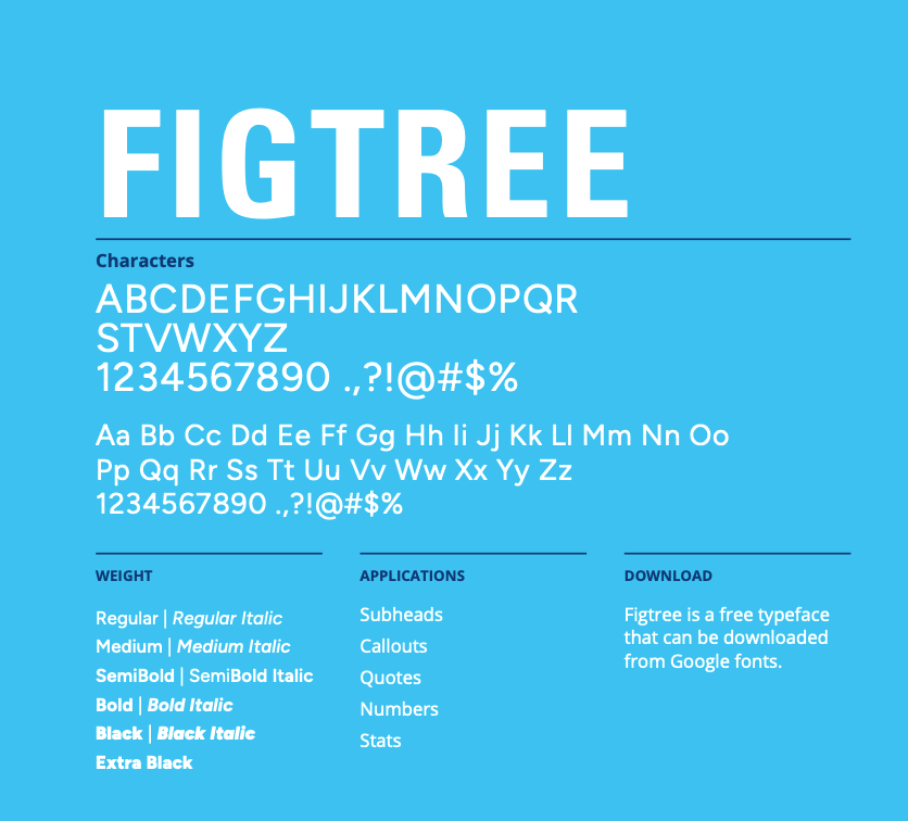
Figtree is used for informational copy and subheads.

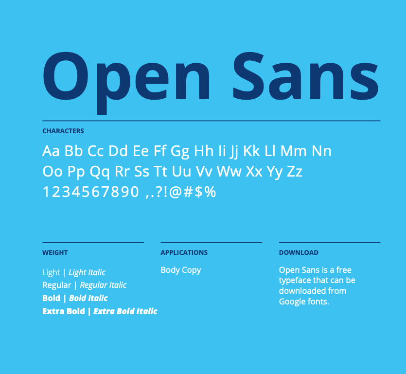
We use Open Sans for body copy because it’s highly legible throughout print and digital applications. Open Sans has a friendly quality that makes our messages feel approachable.

Tiempos: Marquette has a limited number of licenses to use the Tiempos fonts. Priority is given to university-wide projects. However, you — or the department with which you're working — may purchase the Tiempos font from the designer, Klim Font Foundry.
Open Sans: This is an open-source Google font and is available as a free download from Google.
Figtree: This is an open-source Google font and is available as a free download from Google.